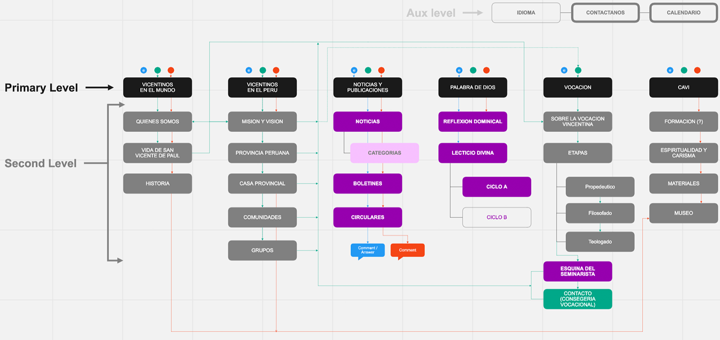
Usability and Business Goals:
Creating the navigation and taxonomy of the CMPeru site business goals and usability standard on mind. From a usability perspective, I included the user journey and flow for the three different UX personas within a hierarchy of content and functions based on the business goals and most popular content categories among the users.
For example, I dedicate the the purple navigation points, in the blue print, to Persona 1. Then, I draw the blue lines to the excepted user journey for Persona 1, also I draw the green lines to represent expected user journey for Persona 2, and I draw the red lines to the expected user journey for Persona 3.
Metrics:
Task Success and Confident level: Before the UAT, I presented to a group of representative users a single task; one for each of the three different personas, within their own journey map in the blueprint, . Because of he small sample size, the tasks success range and confident level ranged between 65% to 100%.

